What typographic factors should be considered when teaching reading and writing simultaneously? Initiated in 2017 at the ANRT (research post-master, Nancy, France), this font project was developed in collaboration with teachers and speech therapists, aiming to question educational typographic conventions and explore non-disruptive solutions.
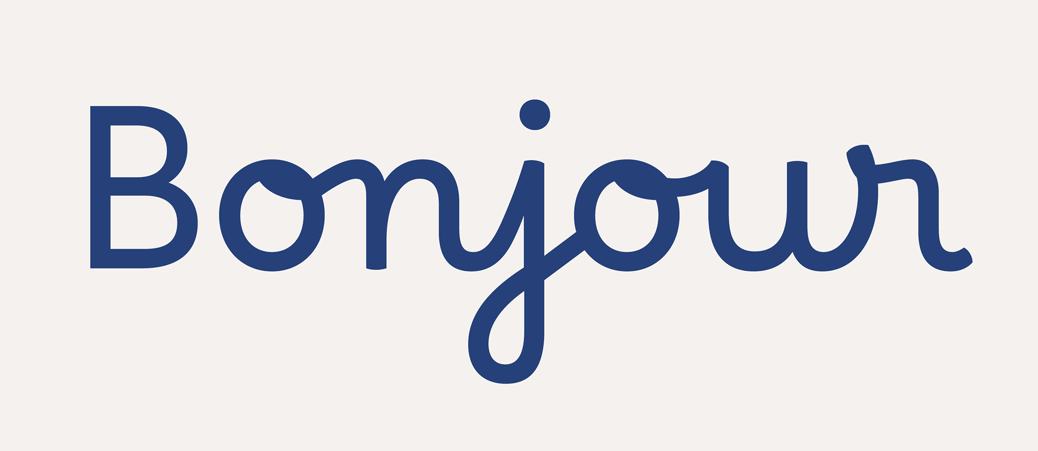
The traditional cursive style taught in French primary schools has a high ascender/x-height ratio, arguing against its legibility at the size of practice. This can pose a challenge for all beginner readers, particularly those with learning disabilities. Thus, Borel aims to harmonise cursive strokes with more common typographic structures that are recognised for enhancing readability. This typeface, named in tribute to Suzanne Borel-Maisonny (a French pioneer in speech therapy), features a robust design with a low contrast and a generous x-height. The letters are intentionally open and clearly differentiated while adhering to the conventions of writing in French schools.
Due to the specificity of this project, the font only supports a limited set of glyphs allowing writing in Catalan, Danish, English, Finnish, German, Italian, Norwegian, Portuguese, Spanish, Swedish, Turkish, Vietnamese—and by extension, any other languages using the same alphabet. Please submit language requests with images in the issue tracker of the repository linked below.
Find the complete article here: Français | English
To contribute, please see github.com/RosaWagner/Borel.