Geom is a contemporary geometric sans-serif typeface designed with a balance between precision and expressiveness. While it draws inspiration from the classic geometric tradition, it introduces subtle dynamic elements that bring rhythm and energy to the letterforms. These details make Geom more than a strictly geometric construction — they lend it character and movement, setting it apart from similar typefaces.
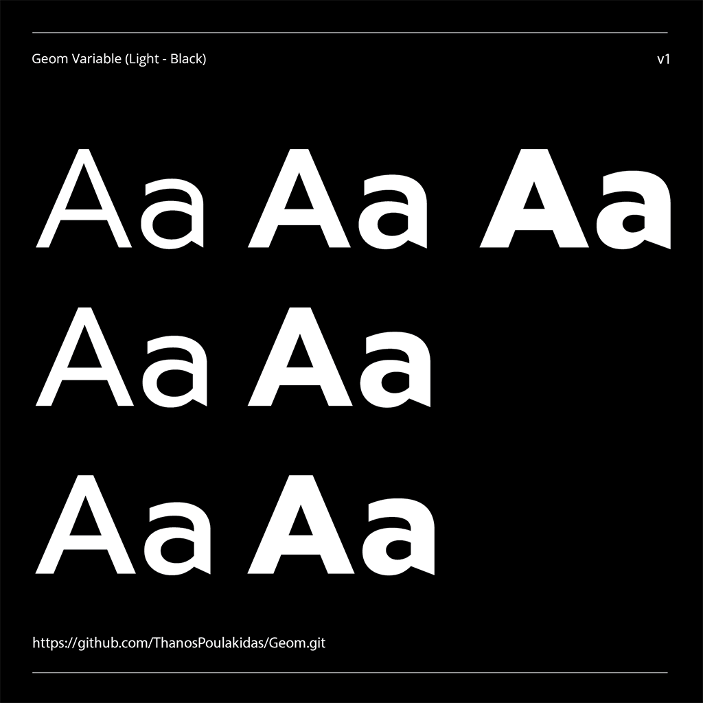
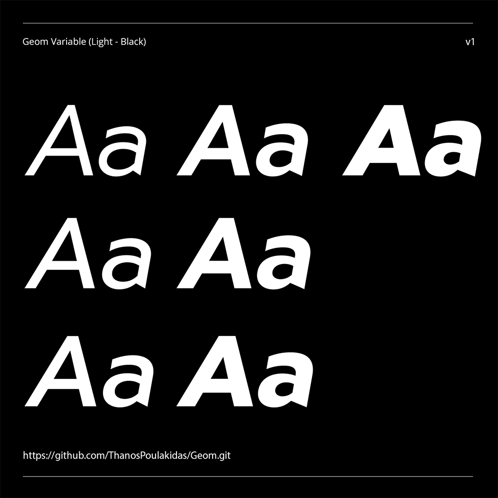
Geom comes in seven weights, ranging from Light to Black, each with its own carefully adjusted proportions to maintain consistency and readability across the entire family. True italics accompany every upright weight, extending the typeface’s versatility and allowing for clear typographic hierarchy and emphasis. The typeface is also available as a variable font, providing designers with seamless control over weight transitions.
Although Geom was conceived primarily for display purposes — in titles, branding, and large headlines — it performs equally well in smaller text sizes. Its geometric clarity ensures excellent legibility, while its subtle deviations from pure geometry make it visually engaging even in extended reading.
By combining geometric precision with refined dynamism, Geom stands as a contemporary sans-serif that balances structure and liveliness — a typeface that feels both timeless and distinctly modern.
To contribute, see github.com/ThanosPoulakidas/Geom.